Xcompliant has default settings that have been chosen to best suit your needs and your users.
However, you also have the option to customize this based on your requirements. It only takes a few minutes to do this and we will generate a script that is perfectly suited for you. You’ll be able to do the customization by going to Settings.

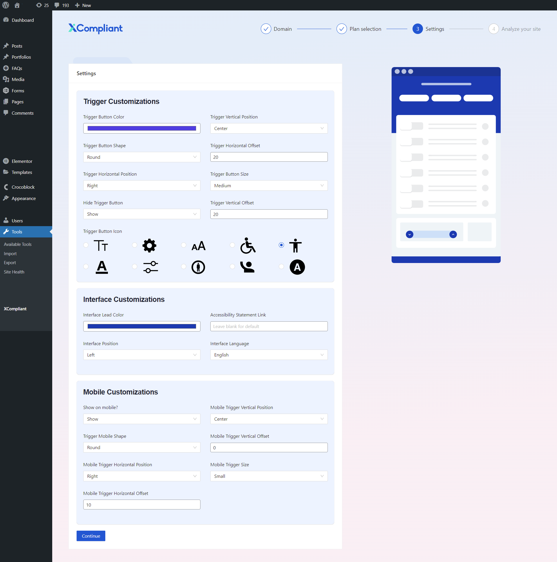
You will be directed to the following interface customization menu:

Below are the following customizations that you can make:
Accessibility statement link – When you click on ‘Accessibility Statement Link’ in the interface, they will be transferred to your own statement. The default option is blank.
Interface footer content – You may present your company in the footer.
Interface language – There are 14 different languages to chose from, the default option here is English.
Interface lead color – You can alter the color of the interface to match your preference. The default color is blue.
Trigger button color – You can choose to change the color of the accessibility button that is used to open the interface. The default option is blue.
Interface position – You can modify the location of the interface. The default option is ‘Left’
Show on mobile? – You can pick whether to show the interface on mobile. The default option is ‘Show’
Trigger horizontal position – You may also choose the horizontal positioning of the accessibility button. The default is ‘Left’.
Trigger vertical position – The vertical positioning of the accessibility button can also be changed. The default is ‘Bottom’.
Mobile trigger horizontal position – The horizontal positioning of the accessibility button on mobile can also be modified. The default is ‘Left’.
Mobile trigger vertical position – You can also choose the vertical positioning of the accessibility button on mobile. The default is ‘Center’.
Trigger button size – Modify the size of the accessibility button. The default is ‘Medium’.
Mobile trigger size – Amend the size of the accessibility button on mobile. The default is ‘Small’.
Trigger button shape – Choose the shape of the accessibility button. The default is ‘Round’.
Trigger mobile shape – Choose the shape of the accessibility button. The default is ‘Square’.
Hide trigger button – You have the option to choose to hide the accessibility button, though Xcompliant will still be present on your site. The default is ‘Show’.
Trigger button icon – You can choose from options of symbols to represent the accessibility button on your site.
Trigger horizontal offset – You may also add horizontal orientation adjustments for the accessibility button. The default is ‘20’.
Trigger vertical offset – You can add vertical orientation adjustments for the accessibility button. The default is ‘20’.
Mobile trigger horizontal offset – You may also have an additional horizontal orientation adjustments for the accessibility button on mobile. The default is ‘0’.
Mobile trigger vertical offset – You can choose to add vertical orientation adjustments for the accessibility button on mobile. The default is ‘0.
Keywords:
Can I change the default settings?
How can I make the changes?

